#02 : Drawn Roman Capitals
This Summer I shared my study of Drawn Roman Capitals to several calligraphy enthusiasts. I learned how they have been studying the form, and which Capital forms have been their inspiration. Studying this form is essential for all calligraphers and for lettering artists and knowing how others have been learning is very interesting to me. I am not sure mine can be interesting to you, but let me share how I have been studying the form.
Middle: Gottfried Pott, Roman Capital exemplar
Right: Claude Mediavilla, Drawn Roman Capitals
When I was taking Reggie Ezell’s year-long course in 2008, I chose these three samples of Herman Zap’s, Gottfried Potts’ and Claude Mediavilla’s works for the Drawn Capital assignment. I enlarged these alphabets and traced outlines in 8 cm height and compared them to Trajan capitals. Then I put those three and Trajan forms together to find the related lines, serifs and forms for developing my own form. It needed more time to make satisfying results, but I learned a lot by vectorizing them to create an exemplar. I created a couple of broadside pieces with my developed Capitals as the assignments.
Later in 2016, I made some painted Roman Capital pieces with a pointed brush using the same form. The image below is a collection of 26 letters from the painted pieces.
Back to the beginning of my calligraphy journey, I had a dream to write this beautiful form. I took Thomas Ingmire’s Traditional Versals correspondence course in 2003. I had a great conversation with Thomas about the difference of writing and lettering, and about the risk of retouching. I also took the SSI Roman Capitals correspondence course. I learned the history of the form, the basic skeleton form and proper spacing and more. But I struggled to make beautiful weighted capital letters as I wished.
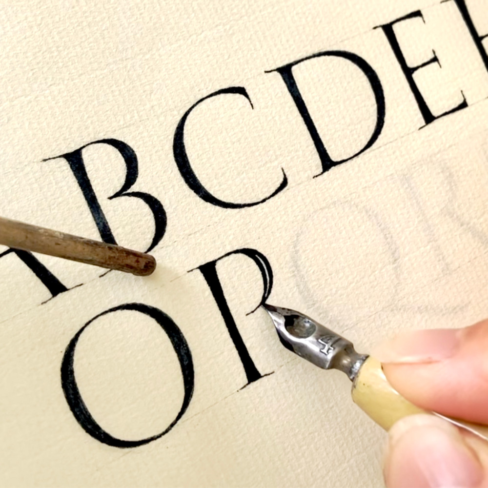
I also took local calligraphy courses to learn the form, and Julian Waters’ workshop in Santa Monica, CA in 2006. At the Cheerio Calligraphy Retreat in 2010, I took John Stevens Brush Capitals. I think my Capitals were gradually improving, but I felt there was still so much to learn and I was a bit discouraged. I didn’t create any final pieces with Roman capitals around the time. In 2014, I took Christopher Haanes’ workshop “Vitalize Your Hand” at Cheerio. I was relieved to think that retouching can be a part of writing. I thought my Roman Capitals were always more drawing than writing, and the workshop led me to Drawn Capital study in depth. To write and draw letters can be as careful as possible to make them in proper formation, but the speed and rhythm should be there with confidence.
Since the pandemic, there have been more online courses averrable. I have taken Elmo van Slingerland, Yves Leterme and John Stevens’s courses. It has been wonderful to see their hands close on the monitor and I have been finding slightly different approaches to write and draw the form. My study of Herman Kilian’s built-up Capitals has been helping me to educate my eyes to look at the Capital forms and the spaces around. Combining all my experiences, I have created some Roman capital pieces as the assignments and as my one of a kind calligraphy pieces.
There are so many lettering artists and calligraphers who write and draw this form beautifully like Giuliano Bocchi, Andrea Russo and more with their soul. I also have been inspired by seeing the live works on social media. I say surely that I would never be able to master this form in my lifetime, but I will always enjoy studying and drawing the form.
My general letterform studies have been deeply influenced by many of master calligraphers’ works from the wave of British calligraphy revival and German calligraphy revival. Edward Johnston, Irene Wellington, Ann Camp, Ann Hechle, Rudolf Koch, Friedrich Popple, Werner Schneider and Hermann Zapf are some of them. Lately, I became a fan of some Swedish calligraphers’ works like Erik Lindegren and Karl-Eeik Forsberg. Their forms are crispy and somehow contemporary. I will keep studying Drawn Capitals with enthusiasm along with other letterforms!
Books for refference
The Eternal Letter, Edited by Paul Shaw, 2015
Tom Perkins, The Art of Letter Carving in Stone, 2007
Stan Knight, Historical Scripts: From Classical Times to the Renaissance, 1998
Hermann Zapf and his design philosophy, 1987
Gottfried Pott, Kaiiigrafie Intensive-Training, 2006
Claude Mediavilla, Calligraphy, 1996
Edward M. Catich, The Origin of The Serif, First published in1968
Edward Johnston, Writing and Illuminating and Lettering, First published in 1906
Gaynor Goffe and Anna Ravenscroft, Calligraphy School, 1995
Susan Hufton, Step-By-Step Calligraphy, 1997
Sheila Waters, Foundations of Calligraphy, 2006